Colour Me Red
Six Dictionaries, One Cut, and a Product About Telling the Truth
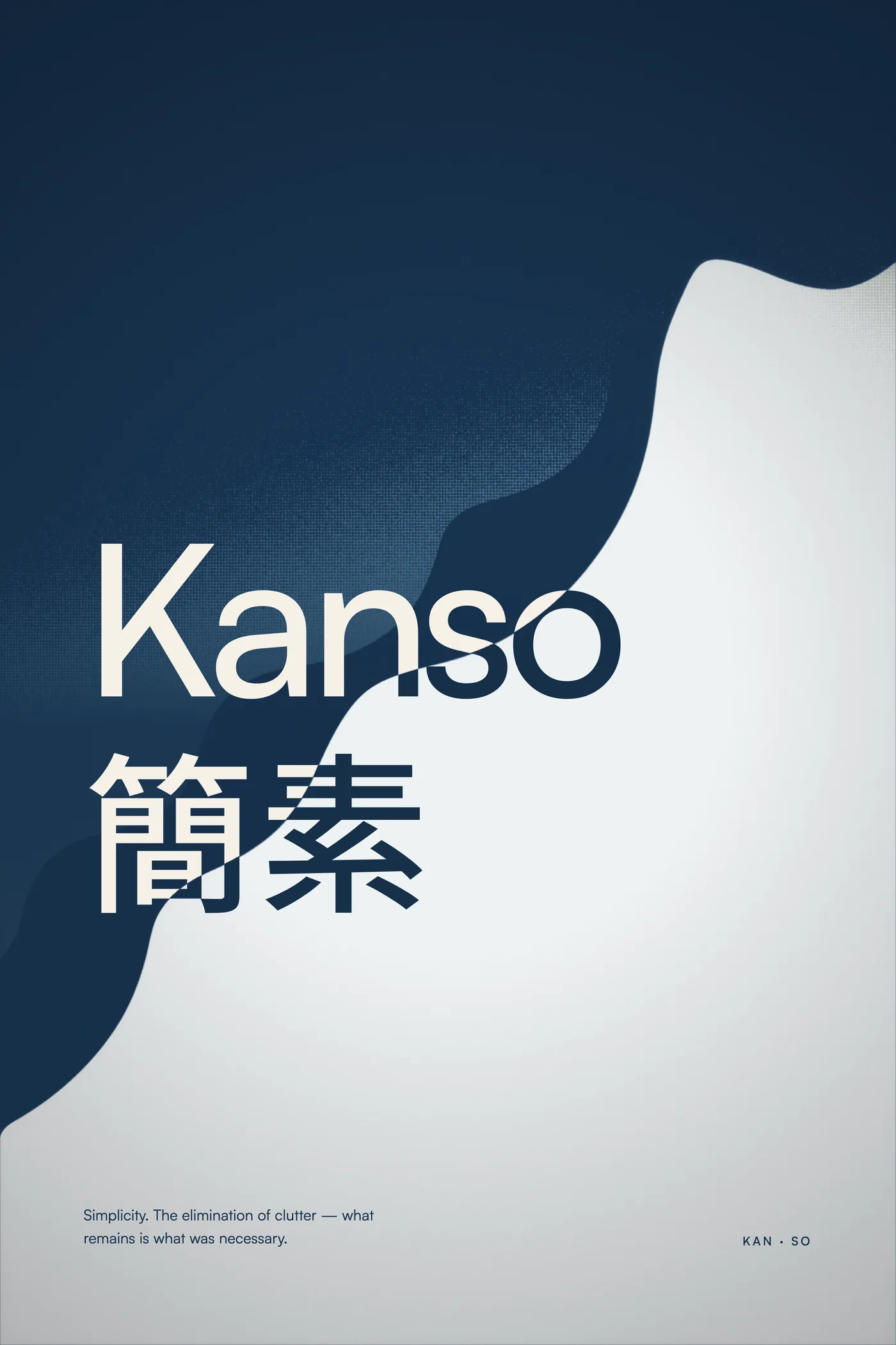
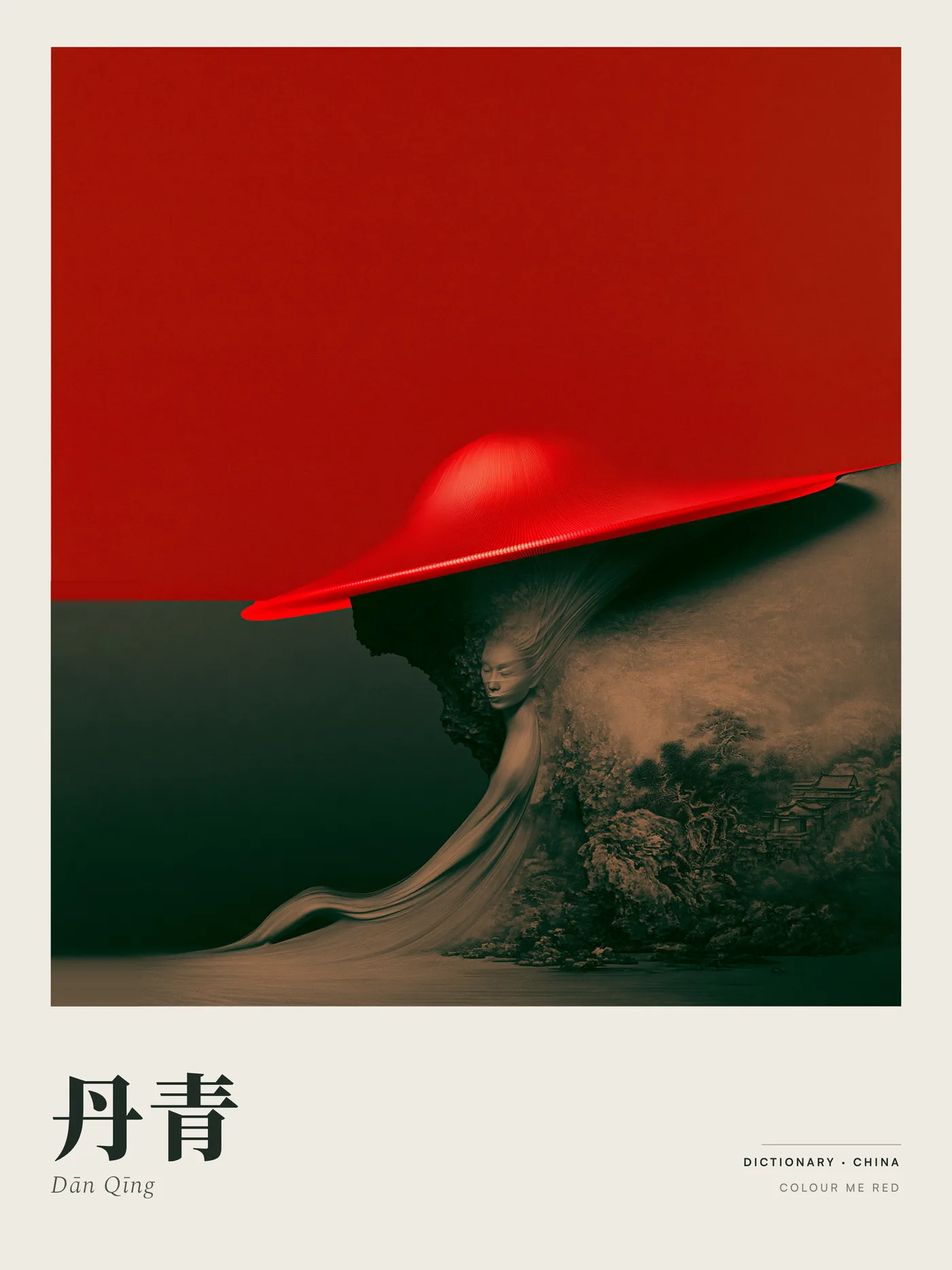
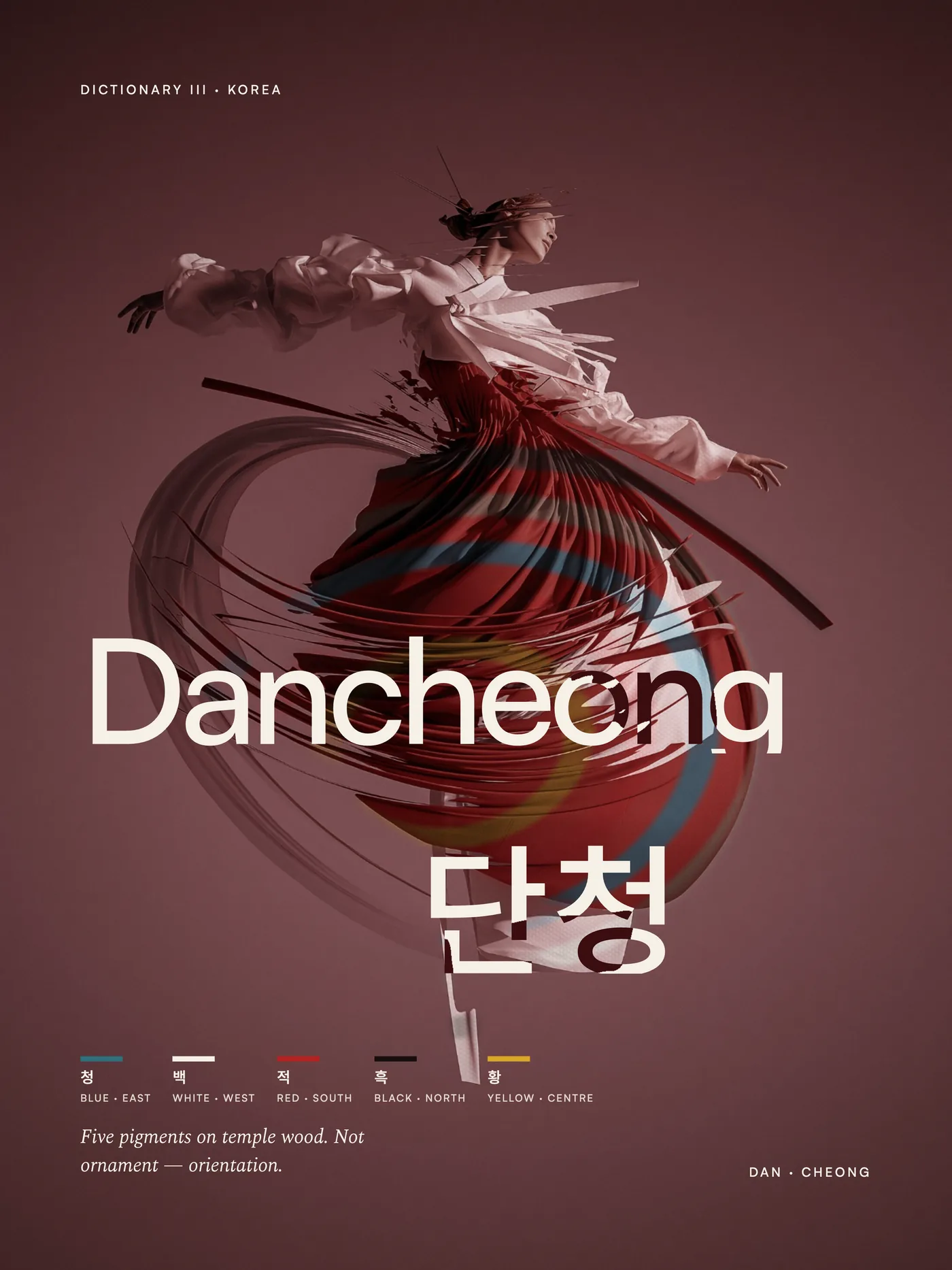
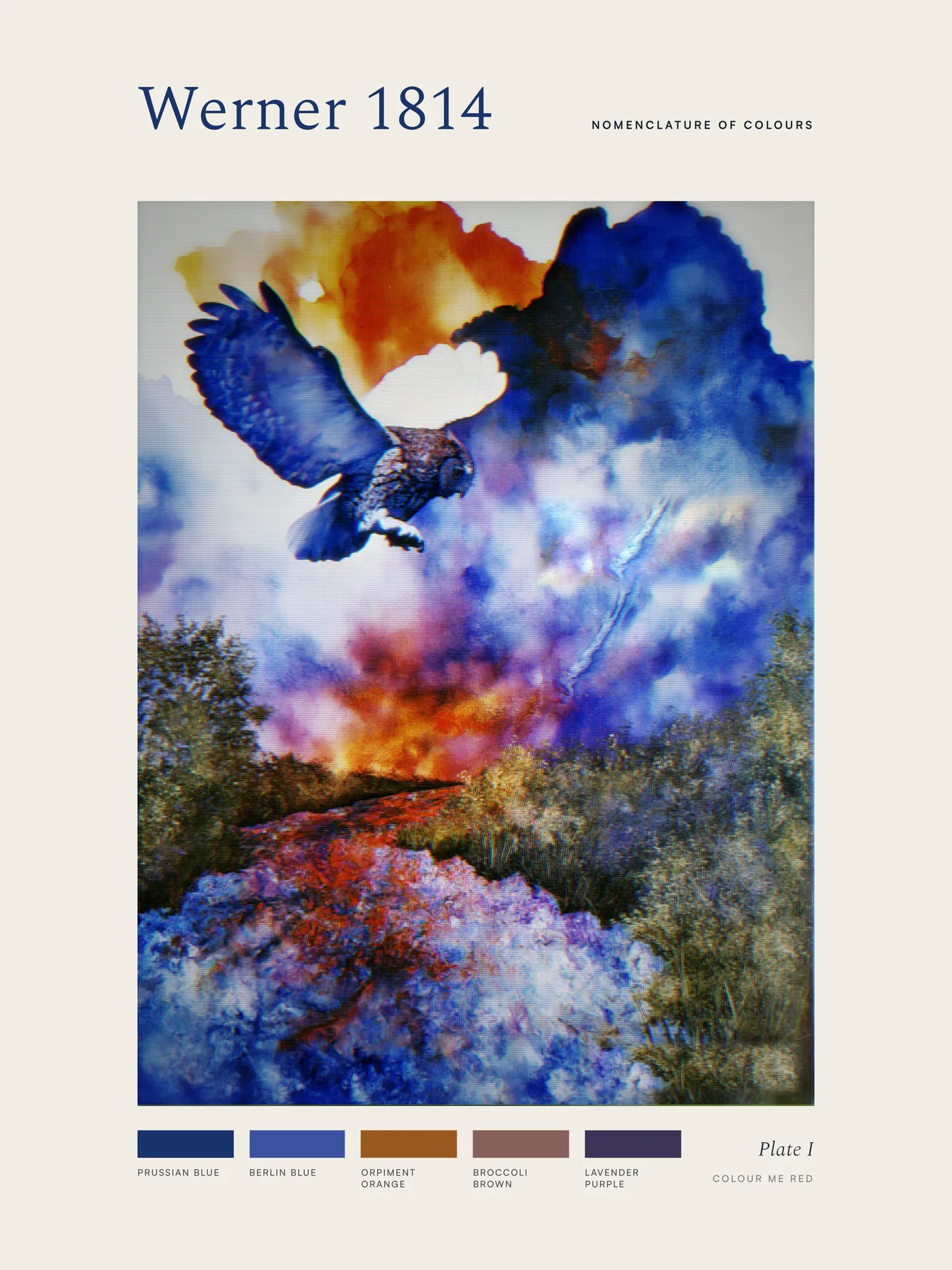
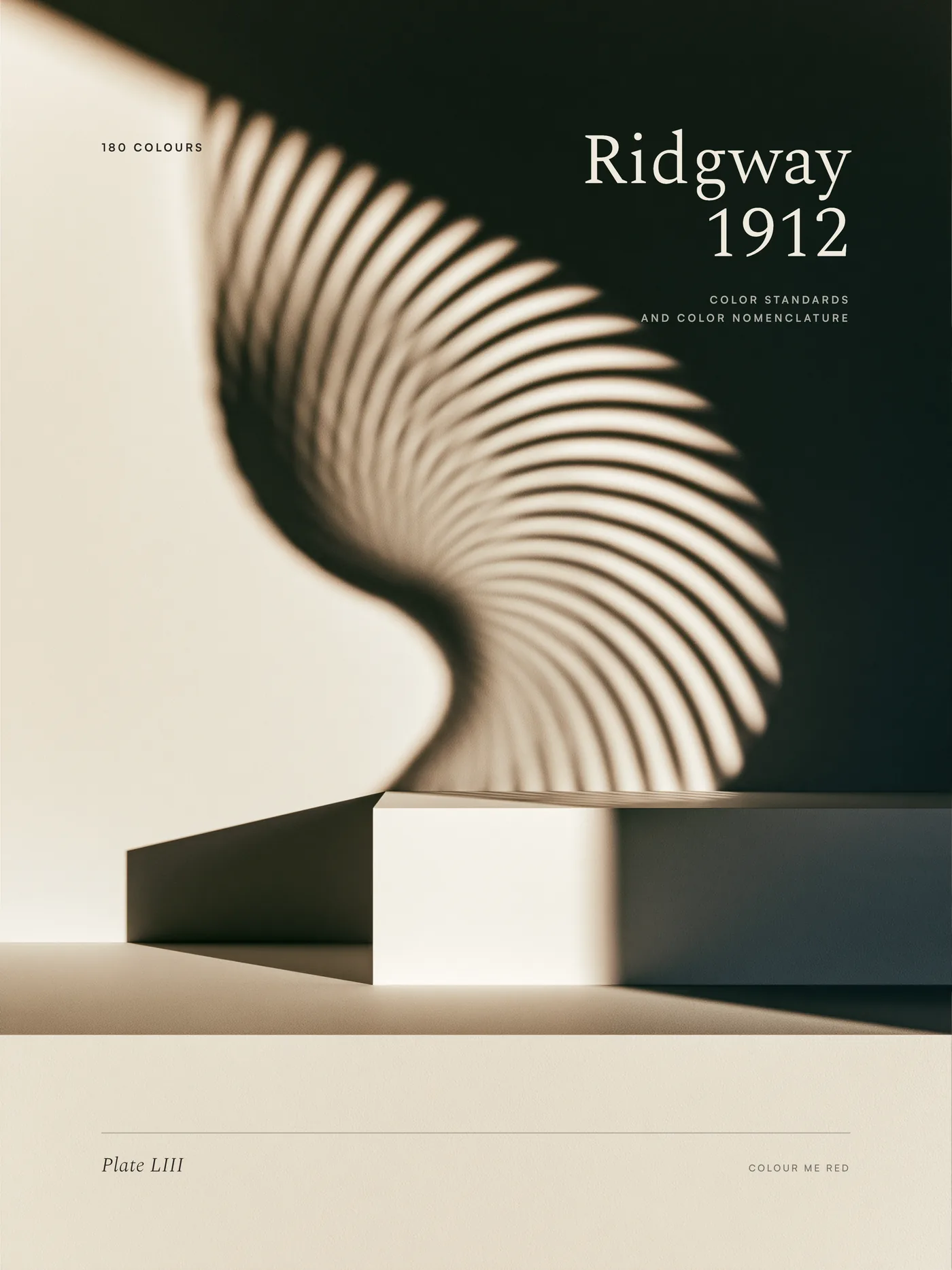
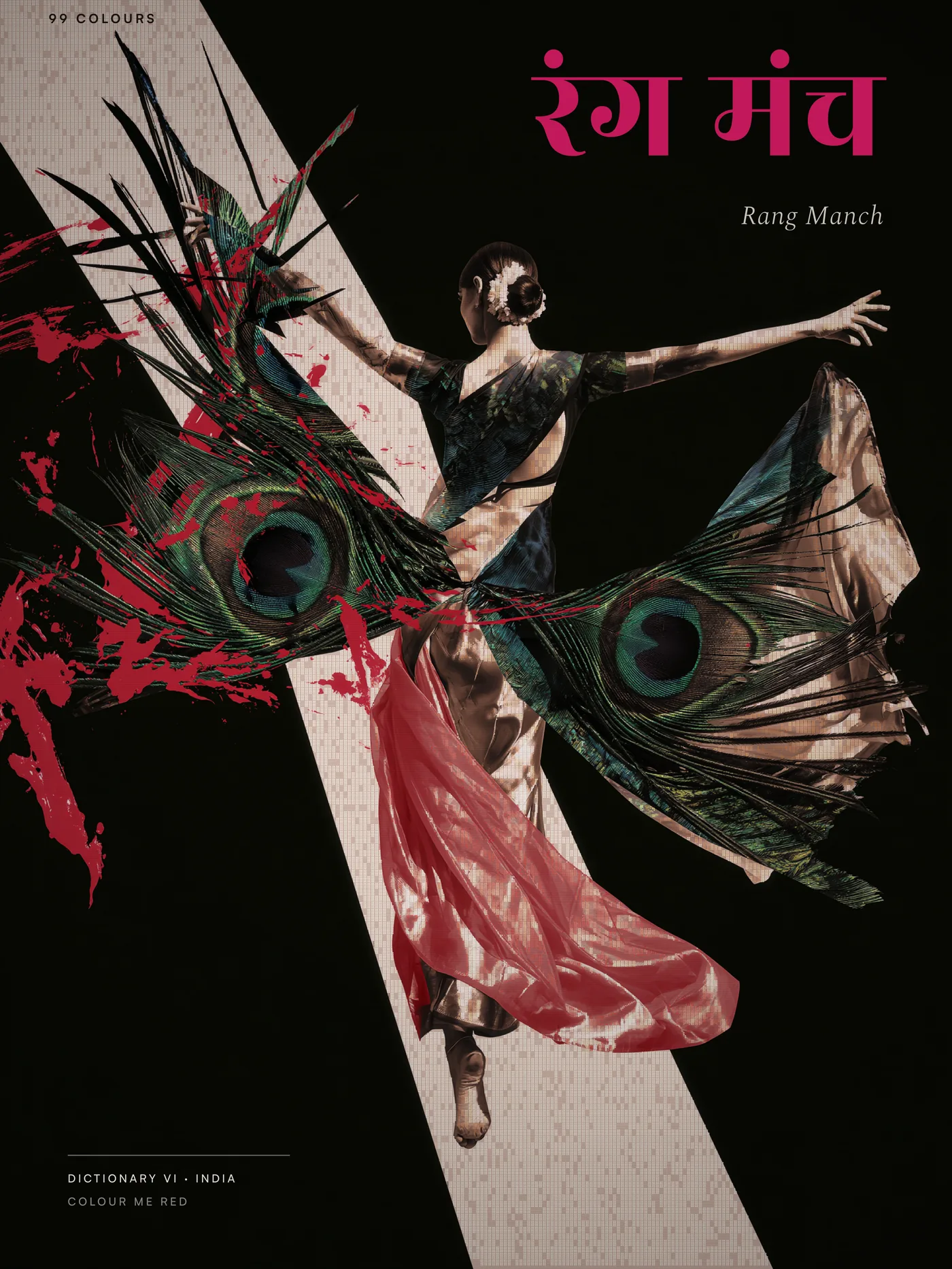
Six 4K dictionary posters, one per corpus, rendered through the project's own parameterised renderer and verified layer by layer. Author's own work; margins checked for generator signatures before publication. Shown here as 1400px WebP derivations — the masters are 2880×3840, and Kanso 3584×5376.
At a Glance
- 796
- documented colours across six corpora, with live drift-checking
- 99
- colours in the Indian dictionary — citations, provenance, confidence grades, kin-links
- 5
- codified dictionary registers, held at five rather than expanded to six
- 30°
- the angle of the cut — the brand's single mechanic
- 2,920
- palette combinations served by one neutral asset, recoloured in code
- 5
- separate false-passes caught by screenshot after passing their own automated proof
- 6
- 4K dictionary posters — one per corpus, rendered and verified layer-by-layer
The brief
Every colour tool on the internet sells swatches. Swatches are a free good — the graveyard of palette startups proves it. Colour Me Red is built on the opposite premise: a colour is worth something when it carries a name, a civilisation, a citation and a confidence grade behind it.
Cloning a hex is trivial. Cloning documented scholarship is not.
The Dictionaries
Six real cultural colour libraries, built with genuine research rigour rather than scraped:
- Japanese wairo — 169 colours merged carefully to 182 authentic entries
- Chinese , organised by wuxing
- Korean obangsaek — modelled correctly as a cross, not a cycle, with parent-pair blends
- Werner 1814 — the actual nomenclature Darwin carried aboard the Beagle
- Ridgway 1912
- Indian — 99 colours across five corpora, added last
A shared engine applies real quality gates: minimum ΔE separation, WCAG contrast, mud filters.
The editorial catch that set the project's standard. An uploaded "1000-palette" reference file was inspected and found to have zero exact hex overlap with the authentic source colours — generated points wearing borrowed labels, by its own notes. The method (structure, ratios, moods) was merged; the fabricated colours were not allowed near the authentic dataset.
The one genuine design decision that survived the Indian addition: the five-stop spectrum was held fixed rather than expanded to six. India enters fully into the data and the tools, but as a distinct living register rather than diluting the codified five. An initial instinct to treat the addition as a heavy brand-book amendment was walked back — the brand book is an internal working draft, not shipped law — and reframed from "amendment" to "bounded addition."
The One Idea: The Blade
The homepage would not resolve, and an early drag-based hero was judged overloaded by its own author's audit — "coherence whiplash." The root cause surfaced later and is the most useful sentence in the project:
"We never got the logo right, that is why we are not able to get the homepage right."
The resolution was a locked brand book: the cut at 30° rising, through RED only, never COLOUR ME; exact kerf and slip measurements; the five-dictionary spectrum confined strictly to RED; Satoshi Black-only typography; explicit NEVERs. Every subsequent build treats the book as law.
The Blade is the concept that stuck. COLOUR ME RED on a dusk ground, a light-blade sweeping through RED at exactly 30°, the spectrum flooding in behind the cut and staying alive. The brand's strictest rule — spectrum only inside the word RED — became the actual mechanic rather than a constraint fought against. No swatch dump. Colour lives only where the rule allows it.
The Recurring False-Pass Pattern
Five separate instances across the build, each of which passed its own automated proof and was caught only by a screenshot or a forced real-path re-test:
1. A doubled kerf gap. 2. Blade-wipe travel maths falling short. 3. A fabricated DNA dictionary-chip colour that did not exist in the real Ridgway dictionary — cited in the project's own brand document. 4. A false focus-ring accessibility claim. 5. A false role-fill test.
The third is the one that matters. A product whose entire premise is we tell the truth about colour was silently displaying invented hexes dressed as real dictionary entries. The fix's most important property was admitting the brief itself was wrong rather than quietly patching around it.
Cultural accuracy was held to the same standard as data accuracy. Japanese iconography — pagoda, red hanko seals — was caught being proposed for the China panel and flagged as the same class of error as a fabricated hex, given the page's own thesis: named by a civilisation; we only did the arithmetic. Imagery direction moved to a documentary and vernacular register — pigment trays, dye vats, lived colour — over decorative postcard imagery, with a standing rule that any shipped image must be owned or licensed. References carrying visible watermarks or signatures are direction only, never shippable.
The self-correction that closed it: "I want the design story, not the cultural story. The more we focus on heritage, the more we feel old to designers."
The Architecture: Generate Neutral, Colour in Code
The hero is a laundry line of dyed sheets — chosen because kasane, cloth layered so colours show through each other, is literally where these colour traditions historically came from. The image is not a metaphor wrapped around the product; it is a picture of the product's origin.
The neutral-cloth recolour decision. Generate every asset in pure white, recolour by multiply-blend in code. One asset becomes all 2,920 possible palette combinations, swappable live on hover. Correctly identified as working for cloth — real luminance and fold data survive recolouring — and explicitly not working for the colour-piano alternative, whose baked keys and fixed perspective cannot be recoloured per instance.
The perspective catch, made before any building. Compositing flat straight-on sheets onto a diagonal receding rope would produce an obvious depth mismatch. Resolved by generating the whole scene as one coherent image with unified perspective and light, keeping only colour as the programmable variable — eliminating the alignment problem rather than fighting it.
The camera-push reframe. An unwanted fast camera push from a failed "static camera" generation was reframed as the actual interaction: an ambient forward drift that freezes on hover and eases back to reveal earlier sheets. Correctly diagnosed as only workable with a code-driven camera, leading to the right next step — regenerate with a genuinely static camera, add the controllable push in code.
The dithering decision — the sharpest semiotic reasoning in the project. Dithering signals nostalgia and faked colour depth; historically it simulated more colours than a restricted palette could produce. Applied to a product about precise, trustworthy colour, it would undermine the entire claim. Scoped to atmosphere only — sky, vignette — and never the sheets, which are the colour claim itself. Governing principle:
Grain in the world, precision in the product.
The flying-sheet transition, and the trap caught twice. The instinct to generate a pre-rendered flying-sheet video was caught as the same coloured-cloth trap already solved — a baked clip would be one fixed colour, requiring 2,920 of them. Redirected to a code-driven animation on the cloth already on screen in the user's chosen colour. The same principle re-applied unprompted in a new context.
One gesture, three scales. Rather than separate transition systems, one flying-cloth gesture dialled to three intensities: full-frame for entering the site, a compressed flutter-wipe for tab-switching, a thumbnail-scale ripple for swapping a single colour. Reasoned as transitions-as-handwriting — a site should be recognisably one hand everywhere — and genuinely less work, since the small version is the big one with beats removed.
Finding the Actual Product
Buried in a description of wanting cross-dictionary mixing — pick a Japanese combination, remove one colour, replace it with a Chinese one — was the recognition that this is the product. Not the dictionaries as fixed reference. Not the transitions as polish. A cross-cultural mixing table with live judgment built in: contrast, greyscale collapse, harmony warnings.
| Tab | Job |
|---|---|
| The Line | Discovery — "show me something beautiful" |
| The Mixing Table | The product — build and swap with live judgment |
| The Collection | The full searchable dictionary reference |
The Feasibility Study, Run Against Its Own Interest
A prior competitive study was independently re-verified and found to contain four real misses. The largest: a major platform's April 2026 open-sourcing of a design specification, which erased three of the product's claimed differentiators in one stroke. The response was to lower the product's own scores rather than explain the finding away.
The palette-tool graveyard — one well-known competitor unfunded for nine years — was taken as hard evidence that colour content itself is a free good, not a moat.
The two real moats identified: the failure layer (deterministic, testable, boring enough that nobody funds it — greyscale collapse, CMYK shift, weak accents), and the author being his own proof, with a live brand carrying real constraints to test against.
The recommendation, with a kill criterion set in advance: not a self-serve SaaS this year. A productised expert service at ₹25k–75k per engagement, selling judgment and implementation confidence rather than swatches, validated against twelve real briefs. Explicit failure condition: three paying clients at ₹25k+ within 90 days, or it is a good internal tool and a poor business.
The Poster Render Pipeline
Six 4K dictionary posters, one for each corpus. Three of them are written up below, because those three each surfaced an instructive bug; Werner, Ridgway and Dān Qīng came off the generalised renderer afterwards and produced nothing worth recording, which is what a pipeline is supposed to do once it works.
Kanso (簡素, Japan) — 3584×5376, 19.4MB. Two straightforward fixes: file:// mask-image subresources blocked by headless Chrome, and an unfetched Japanese glyph subset. The real catch: the background substituted into the render was confidently matched at 98.6% luminance correlation — and was the wrong file, a clean twin of the correct dithered source. The metric scored overall brightness agreement, not the dither texture that actually mattered. The same false-pass shape as every other one in this project.
Dancheong (단청, Korea) — 2880×3840, 7.7MB. An unfamiliar, undocumented bundler format reverse-engineered through systematic inspection rather than guessing. Two render attempts failed and were misdiagnosed as timing problems; wider viewports and looser waits fixed nothing. The real cause: a selector matching the first element with an attribute — an unrelated 0×0 template node — not the poster frame. Found by dumping every matching element across three DPI settings rather than attempting a third timing fix.
Rang Manch (रंग मंच, India) — 2880×3840, 10.3MB. A template-parsing format difference caught by a length sanity check rather than assumed identical to the previous case. Rather than write a third one-off script, a generalised parameterised renderer was built — file, output path, target resolution as arguments, force-loading every declared font rather than guessing weight and glyph combinations.
Standing Rules the Project Produced
- Grain in the world, precision in the product.
- Generate neutral, colour in code. Blend in compositing, not in the generator.
- Generate married; separate only what must stay programmable.
- Camera motion belongs in code if it needs to respond to interaction.
- The best metaphor is the one that is already true, not the cleverest one.
- Numeric proofs are necessary but not sufficient. Actively try to break your own tests.
- Never let a fabricated or hand-typed value ship where real data exists.
- Scroll is the right engine for motion and the wrong engine for decisions. Every hand-off from a scroll reveal to a user choice must be a deliberate, named seam.
- Foundation bugs caught early cost one fix; caught late, they cost re-proving everything built on top.
- Sell judgment, not swatches.
What It Demonstrates
Cultural research held to citation standards, a brand system whose single strictest rule became its central mechanic, an asset architecture that turns one white cloth into 2,920 palettes, and a competitive analysis that argued against its own product. The through-line is the same one the product sells: telling the truth about colour, including when the truth is inconvenient.
Assets to attach: the brand book, the Blade hero, the three 4K posters, the dictionary panels, the mixing-table designs.